

A two-sided marketplace matching vetted sustainability experts with the companies that need them.
- Role
- Brand, UX/UI & illustration designer
- Timeline
- 2024–2025
- Platform
- Web
I balance what the business needs with what users need, and make the value clear at a glance.
UX/UI case studies. Each one covers the problem, the research, the process and what changed.
A two-sided marketplace matching vetted sustainability experts with the companies that need them.
First understand, then identify, prioritise, problem-solve and achieve. Greenpertise vets sustainability experts and matches them with the companies that need them; I designed its brand, its illustrations and its website from the ground up.
Sustainability regulations change fast, and they differ from one continent to the next. Experts need support, education and the right discovery tools simply to keep up, and the companies hiring them, as our interviews would soon make plain, found the market confusing and overwhelming.
Greenpertise, a young Austrian startup, wanted to be the place where small and medium-sized companies meet vetted sustainability experts. It had no visual identity yet. None. The brief was to build one from the ground up, along with a website that made experts and companies each want to join.
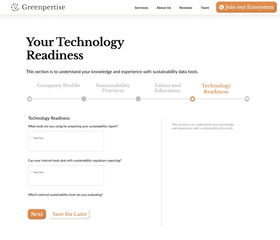
Alongside the team, I designed Greenpertise’s brand and visual identity, its 3D illustrations and the website’s UX and UI, working from solution statements built on user research. My own view was simple: the identity had to carry the brand’s values, sustainability, community and friendliness, well enough to educate leads and turn them into customers.
We began with an in-depth competitor analysis and brought stakeholders in from the very first day. To understand what users wanted, what they needed and where they struggled, we ran qualitative research and interviewed around 50 people from small and medium-sized companies focused on sustainability.
The picture that emerged was clear. These companies struggled to navigate a complex market and to make a meaningful impact. Greenpertise, meanwhile, wanted more features than the budget and timeline allowed, so we ran workshops to scope a minimum viable product around the features that would matter most.
The turning point came in an opportunity-mapping session. We mapped the most promising opportunities, we voted, and we committed to the most feasible ones. A workshop with a focus group then let us go deeper into users’ ideas and settle on the right approach.
The marketplace serves two audiences, so the site speaks to each directly: strategists and specialists looking to widen their work on one side, companies looking to build sustainability expertise on the other. Each vetted expert sits against a shared framework of sustainability topics, so a company can see exactly what expertise is on offer before it ever reaches out. Nobody has to guess.
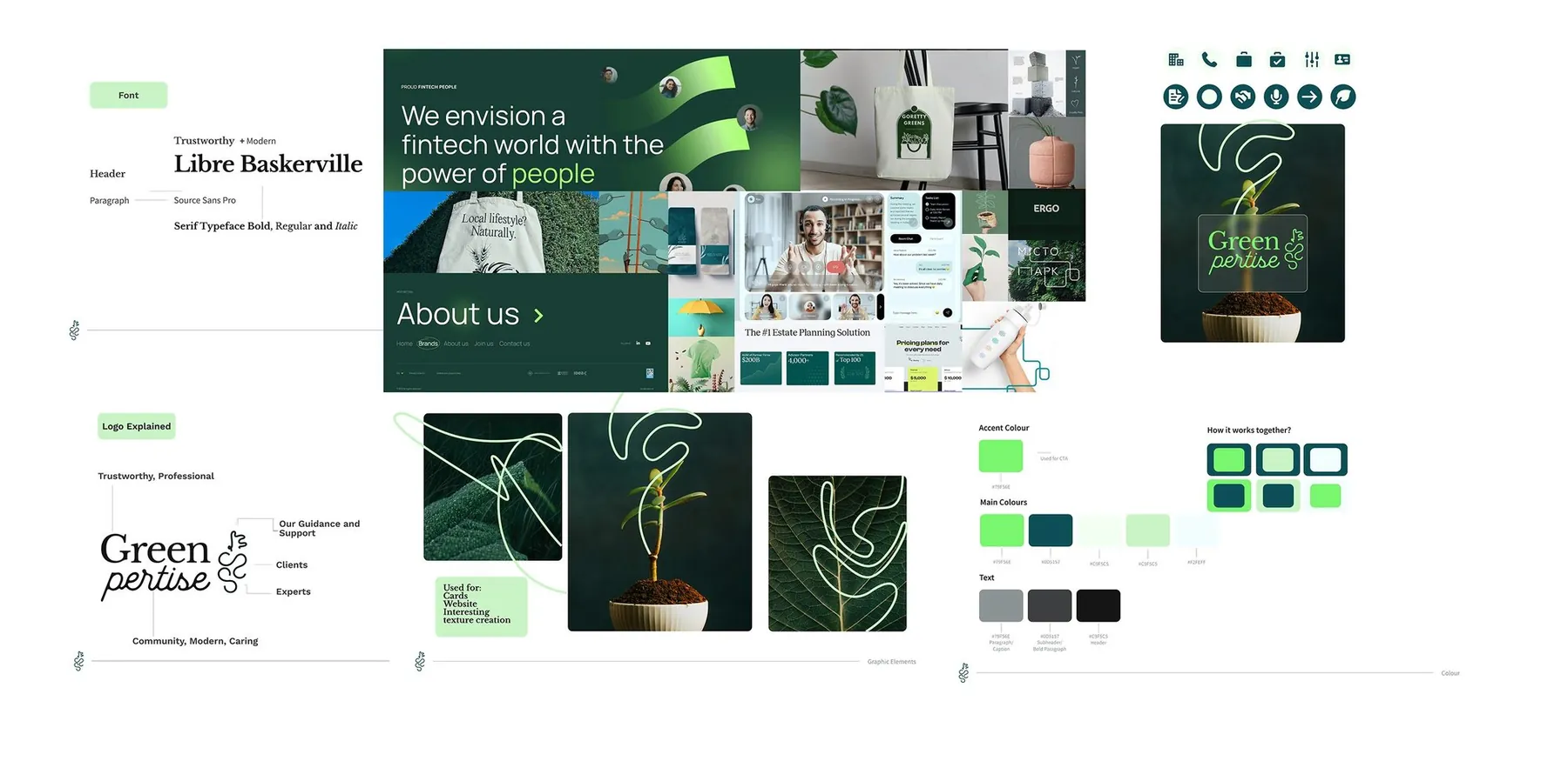
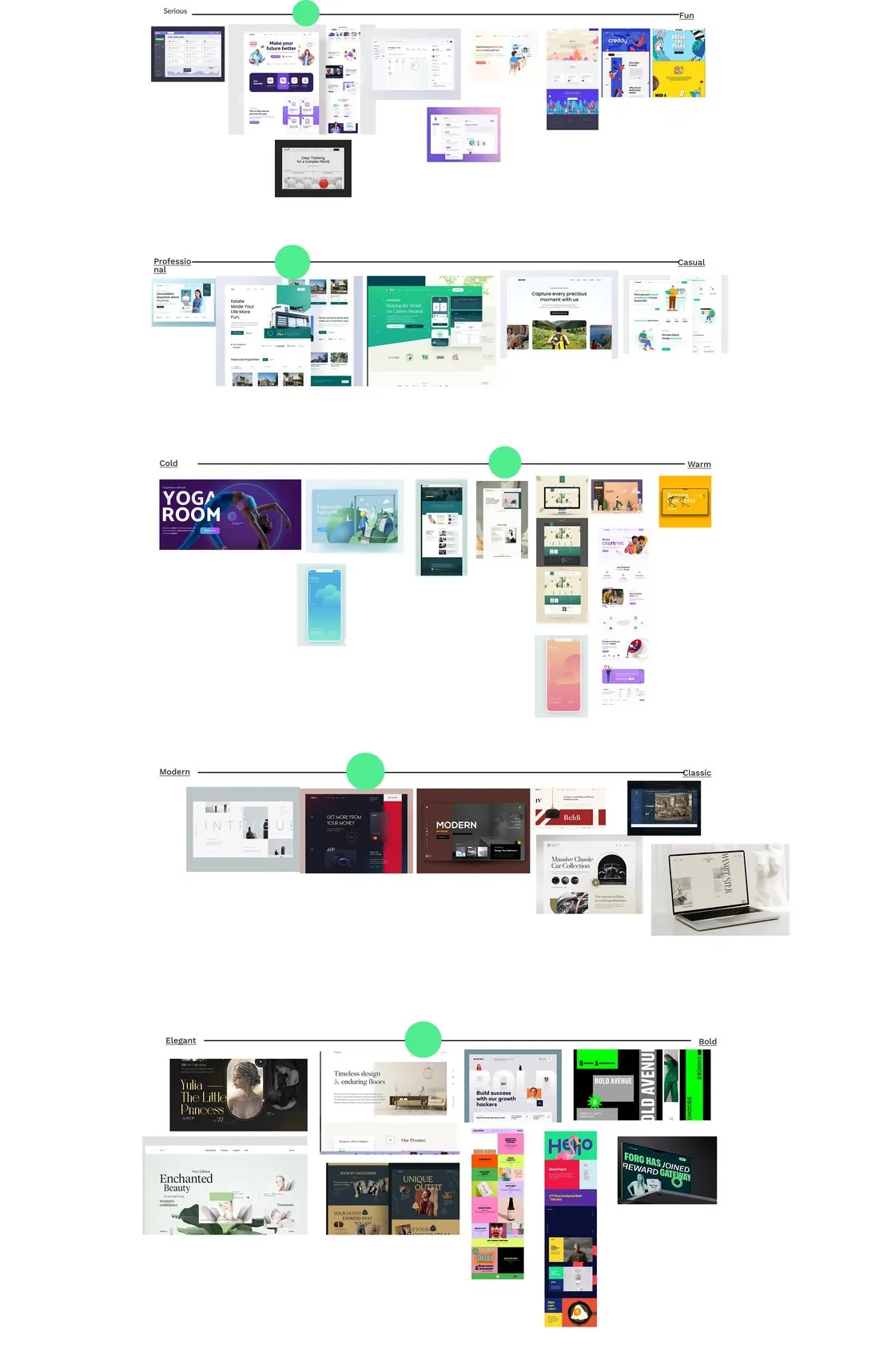
A tight deadline first produced a branding concept that the stakeholders didn’t fully connect with. Rather than push it through, I ran a branding workshop to uncover what the words they used really meant to them. That workshop gave us a cohesive identity: a calm forest palette, Libre Baskerville for character, and a logo built from a ring of dots.
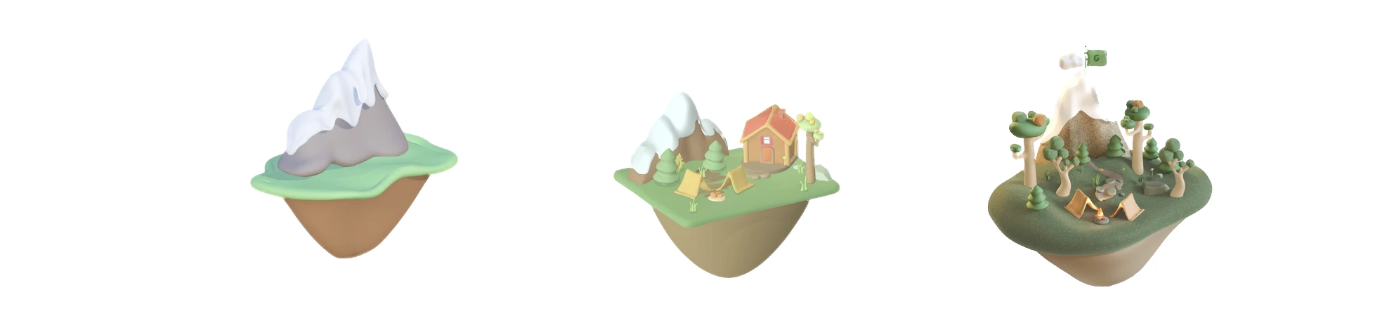
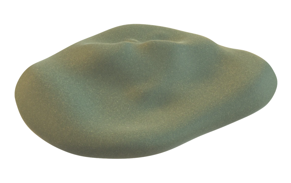
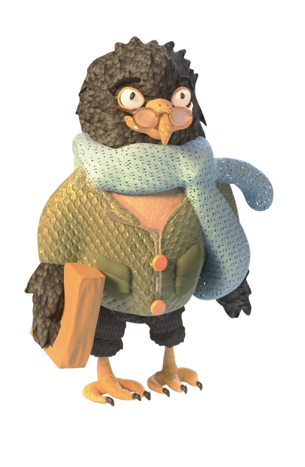
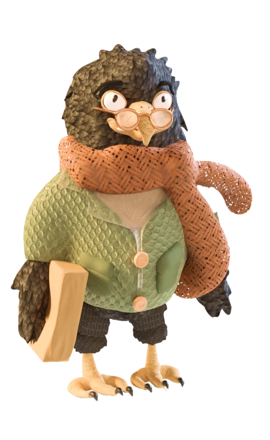
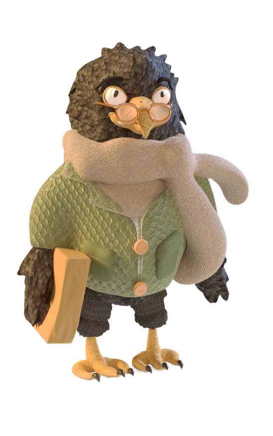
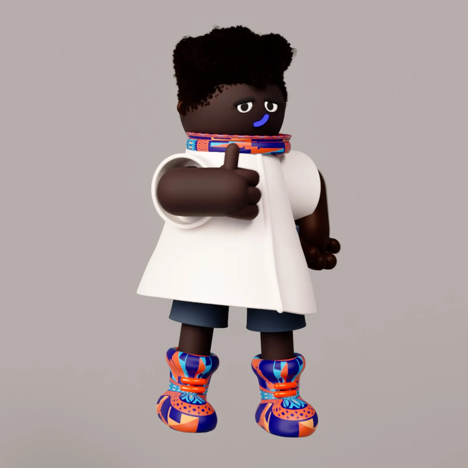
I created a family of soft 3D illustrations so the site would feel optimistic rather than corporate: floating islands, career objects and people at work. The hero island went through several rounds, from a bare peak, through a small village, to a living landscape with a camp, trees and, at the very top, a Greenpertise flag.

































The final design resonated with stakeholders and users alike. The website launched successfully, connecting companies with sustainability experts, and along the way I also ran Figma teaching sessions for the team.
Then came the part no mockup can promise. Greenpertise was accepted into the Austria Wirtschaftsservice incubator programme, which provided funding, structure and coaching and led to the expert-matching service. The company went on to a base at the Climate Lab, a sustainability coworking space in Vienna, and its founder spoke at the British Embassy in Vienna on empowering women in climate tech.
Greenpertise supported over 60 sustainability career paths in 2024 through one-on-one guidance and six sector-specific peer pods. Fifty experts and fifty companies are now vetted into the ecosystem.

A loyalty app redesign for the largest shopping centre operator in Saudi Arabia.
The future of easy shopping: a loyalty app for Cenomi Centres, the largest owner, operator and developer of lifestyle shopping centres in Saudi Arabia, where every riyal spent earns points to be spent again across the network.
Cenomi began in 1990 with two menswear stores in Riyadh. From there it grew into the country’s largest fully integrated retail and shopping centre group, partnering with brands like Inditex, Apple, Decathlon and Subway.
Its loyalty programme had to turn that scale into something personal: members earn points for every Saudi riyal spent at participating stores, and redeem them for discounts, exclusive offers and experiences across a large and growing network of malls. Earning and spending had to feel effortless. And the app had to give people a reason to come back.
 Rewards
You have: 200,000 Points
You need: 5,000 Points for Platinum!
Earn 500 bonus points by completing it
Amazing Benefits From Top Brands
Tasks that add up fast
500 points
Shop at 2 brands within two weeks
800 points
300 points
I created the design system and kept iterating on it, which cut the workload for the rest of the team, and I worked closely with a Senior UX Designer on the app’s gamification and point-sharing.
We wanted points to be used meaningfully, for family moments or for good causes. Looking at it as an outside observer, I proposed a leaderboard inside family groups, so members can see and compare how their family earns and spends.
We started from research the client already had, then widened it to understand what loyalty programmes are becoming and the experiences they ought to offer. It gave us four ideal users:
Love new experiences and trends, and find joy in shopping.
Value quality, authenticity and aesthetics; shopping is an investment.
See malls as social spaces for entertainment and convenience.
Traditional and responsible, with routines and careful decisions.
Those insights became the foundation of the brand. Every design decision, large or small, was checked against three principles:
A seamless experience where spending money and earning points feels effortless.
Part of members’ lives: catering to their needs and delighting them with experiences.
Personalised content, so every interaction with the app feels personal and understood.
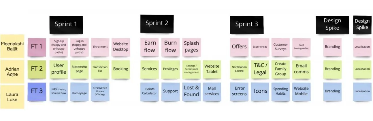
With research and brand guidelines in hand, we designed the journey in focused sprints, each on a different part of the product: the app first, then the website.
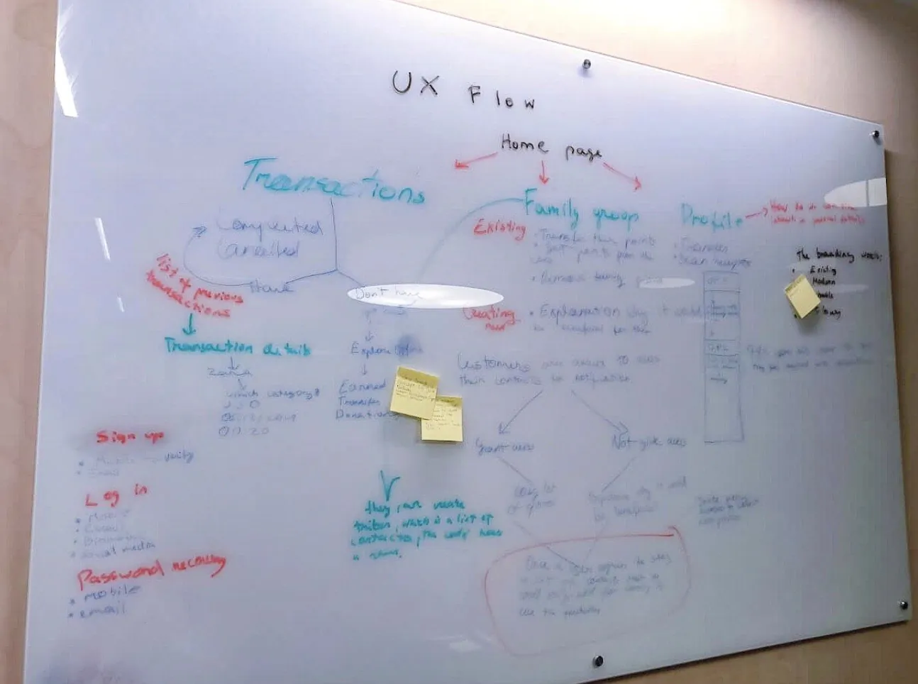
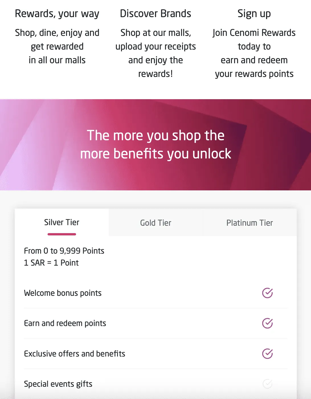
The core flows cover the full loyalty journey: home, offers, experiences and privileges, and a profile where members see their points and membership and share them with family and friends. A tiered, task-based system, with levels, point thresholds and tasks such as completing a profile or referring friends, guides new members towards engagement. In my eyes, one finding outweighed the rest. Guided feedback and gamification were the biggest levers on retention.
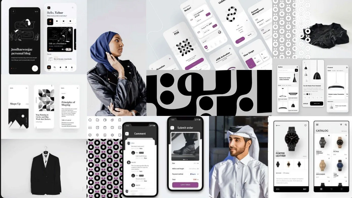
The moodboard set the tone around the three principles and was presented to the client for alignment. A vibrant fuchsia stands for uniqueness, confidence and inspiration; I developed the typography and a pattern system so the experience would feel emotional, exclusive and unique.
The programme went through a light rebrand alongside the UI work, with motion and graphic patterns that reinforce the app’s identity. In the final stage we prepared every UI screen for the developers, with close attention to detail. Then, late in the day, the client’s feedback arrived. It meant some quick design changes, and the team still delivered on time.
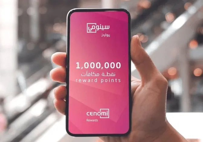
Cenomi Rewards launched with point sharing, family groups, easy booking and points donations across Cenomi’s shopping centres. Today it holds 4.6 out of 5 from 940 ratings, and members regularly cite the app itself.
Looking back, more research would have refined the experience further. Cultural differences between British and Saudi Arabian users needed more attention, as did usability for members with disabilities; and with more time, we would have pushed animation and transitions further.
My recommendation is simple: deeper research into cultural differences and accessibility, so the app works for every member and the programme becomes even more inclusive.
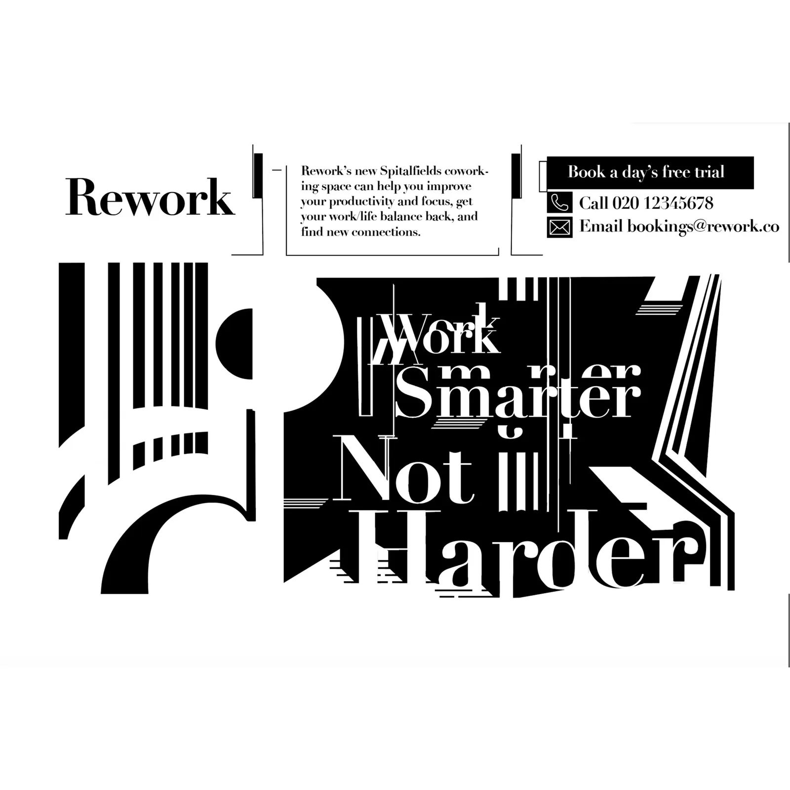
A separate practice: identity, packaging, type and print. Shorter pieces, shown rather than explained.

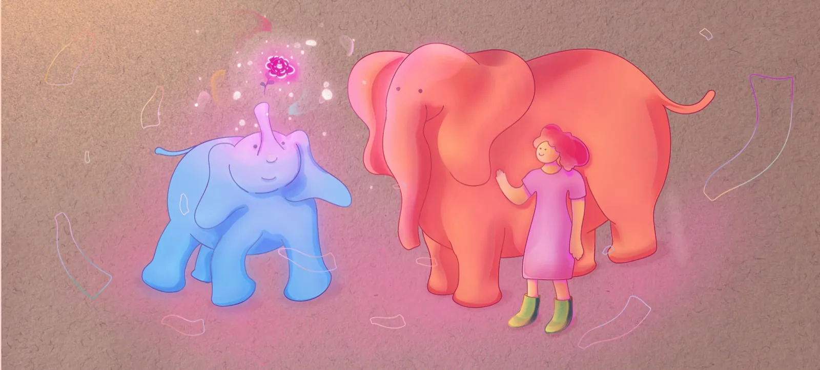

An illustration inspired by London Underground's "Mind the Gap" signage.

A poster series exploring Canary Wharf and the Underground through bold, cropped type.

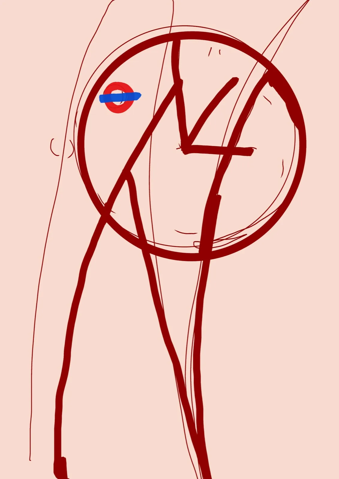
A personal illustration piece — part of a self-directed character study.



I'm a London-based product designer specialising in design systems, AI-driven experience design and visual design, with a background in graphic design and illustration. I'm direct and collaborative, and I value honest, constructive feedback over comfortable silence.